
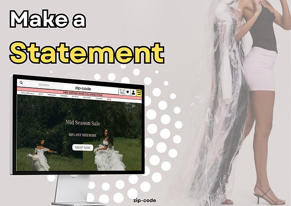
zip-code

Redesigning consumer e-commerce website experience for +5k buyers
TIMELINE PLATFORM MY ROLE
Dec 2025-Apr 2026 WooCommerce Product Designer
Introduction
Zip-Code Clothing is a South African fashion retailer specializing in trendy, young ladies' apparel, with both an online store and physical retail locations. The brand focuses on "sexy and stand-out" fashion, offering a variety of apparel suitable for evening, corporate, and casual summer looks.
In this project, we revamp the user experience and redesigned the UI.
My Role
I'm the lead product designer for this project. I collaborated with Zip-Code's CEO throughout this project.
Problem
Since 2023, Zip-Code's website experience has not been changed. Here are the key problems with the core experience.

PROBLEM #1
WEAK VISUAL HIERARCHY
Weak visual hierarchy directly impacts the conversion rate for this ecommerce website. Everything looks the same (banners, products, text). There is no strong contrast between headings, sections and CTAs.
EXAMPLE
The homepage represents multiple elements with similar visual emphasis, making it difficult to identify what is most important.
IMPACT
Without a clear hierarchy, users are not guided toward key actions, increasing cognitive load and reducing the likelihood of engagement or conversion.

PROBLEM #2
BRAND AND PRODUCT PERCEPTION
The copywriting and visual elements do not speak to our brand - they lack consistent emotional branding and a clear strategy.
EXAMPLE
The site says: " The latest in women's online and instore"
This is generic and doesn't differentiate the brand.
IMPACT
A product without a strong branding is just a website.

PROBLEM #3
NO DEFINED JOURNEY
Unclear user experience leads to frustration in users - in turn increases the drop off rate.
EXAMPLE
There are multiple entry points to perform the same action. Users have access to two navigation menus.
IMPACT
With no defined journey, users easily get lost and lead to low conversion or engagement.
Defining the Problem
How might we redesign a better experience to reduce friction, improve product discovery and
and guide users more effectively from browsing
to purchase?
Goals
BUSINESS GOALS
Strengthen the value proposition
With a wide range of items available, the goal is to highlight key product categories and best-selling pieces more effectively. This ensures users can quickly understand the brand offering and discover relevant products without friction.
Improve product discovery and shopping flow
The current experience makes it difficult for users to navigate and explore products efficiently. The redesign aims to create a more structured and intuitive browsing experience that supports faster decision-making and encourages deeper engagement.
Increase conversion through clearer user pathways
By simplifying the layout and strengthening calls-to-action, the goal is to guide users more effectively from browsing to purchase, reducing drop-off and improving overall conversion.
USER GOALS
Quickly understand the brand and offering
Users want to immediately understand what the brand offers and whether it aligns with their style or needs, without having to search for key information.
Easily discover relevant products
Users need a structured and intuitive way to browse, filter, and explore products that match their preferences, without feeling overwhelmed.
Navigate the site with ease
Users expect a clear and predictable layout that allows them to move through the site effortlessly, finding what they need without confusion or unnecessary steps.
Make confident purchase decisions
Users want clear product information, pricing and visuals that help them feel confident in their choices and reduce hesitation during the buying process.
Complete purchases quickly and smoothly
Once users decide to buy, they expect a fast and frictionless path to checkout, with minimal barriers or distractions.
Impact
As this is a conceptual redesign, live performance data is not available, I have omitted the actual values for these metrics.

19%
increase in overall conversions
+28% sales conversion
23%
increased interaction with primary calls-to-action and
product categories


40%
reduction through stronger first impressions and clearer value communication
Our Users
Before I started designing, I took a deep dive into existing behavioural and purchase data of our users to understand them better. I also conducted a series of customer interviews.
I focused on identifying the core "jobs-to-be-done" what users are trying to achieve when visiting the site.
I defined 3 user archetypes, and mapped them to their respective jobs-to-be-done.

The Intentional Shopper
This user visits the site with a clear goal in mind. They know what they're looking for and want to find it quickly. They value efficient navigation, clear categories, and fast access to relevant products.
JOBS-TO-BE-DONE
When I have events to go to, I want to find the items I want quickly so that I can spend more time doing the things I love.

The Browsing Explorer
This user is casually browsing without a specific purchase in mind. She is drawn to visually engaging layouts, featured products, and curated sections that inspire discovery.
JOBS-TO-BE-DONE
When I'm looking for new items to add to my wardrobe, I want to find new styles and products in an engaging aesthetic way.

The Deal-Driven Shopper
This user is motivated by value and actively looks for promotions, discounts, or highlighted offers. She expects deals to be clearly visible and easy to access.
JOBS-TO-BE-DONE
When I want new clothes, I want to find the cheapest offer, so I can keep the money for what is important for me and my family.
Process
I conducted the design process through a iterative, user-centred approach, combining analysis, research and design exploration to arrive at a more effective solution.


_edited.jpg)

User Flow
I mapped each archetype to their user journey on the website.
On the top, we have the current user flow.
On the bottom, we have the newly improved user flow.
Current User Flow

The Deal-Driven Shopper
The Browsing Explorer
The Intentional Shopper
Improved User Flow
The Intentional Shopper
The Browsing Explorer
The Deal-Driven Shopper

Sketches
I sketched multiple user flows to visualize ideas quickly. My focus at this stage is to diverge first, converge later. Here are some early sketches of the Homepage.

Early Designs
A sneak peek into my early wireframes, mid-fidelity designs and drafts. The designs have gone through multiple iterations due to: change in business direction, shift in product roadmap or to improve user experience.
Homepage
We want the homepage to be personalized to each user. These are the various designs I tried that did not make the cut. This could be due to a number or reasons like unclear value preposition, cluttered designs and lack of scalability.


Explore Tab
A place for further exploration so users can discover something new and interesting. One of our design principles is that each screen has a singular purpose. This is so we don't overwhelm the user with too much content on the Explorer Tab.

This takes up too much
space
we went through +50 iterations
The initial designs went through several discussions with the business team and user tests, to ensure we have a friendly and scalable user experience.
I wish I could show every part of the process!
Usability Testing
To validate my designs or test prototypes, I did guerrilla testing with users. This was done in-person and on zoom.
We've tested the prototype with 10+ people.
_edited.jpg)


Final Designs
Here's a detailed walkthrough of the revamped website.
New look. Better feel.
Before the redesign, the website was bare, it lacked focus on Zip-Code's core products. Now Zip-Code has a new modern look and a better experience. To improve the product and product perception, I introduced new, scalable components and redesigned micro-interactions.
Brand Guidelines

Alternative Logos
secondary


Colour
Palette
#8D1010
#FBF6F6
#FFDE5F
#F4A1A1


Designed for discovery: the search tab
Users can now navigate to find products easily. Detailed breakdown below

Cluttered, outdated UI makes it hard to read and get information quickly
Information displayed is not useful. It's unclear whether this was meant to be a button or just information
BEFORE
Search bar is prominent and easily accessible

AFTER
CTA hard to miss
Improved product listing
I have separated the product cards to make it easier for the eye to view and follow

Unclear hierarchy, making the layout feel flat. The UI is clean but generic
Missing a call-to-action
The product images have inconsistent visual balance
Products visually float in space
BEFORE
Personalization and ability to continue where you left off leading to a stronger visual hierarchy
Product cards feel more structured, it has clear containment, organized layout which allows for easier scanning

AFTER
Stronger product detail page
I added better images and more relevant information to make the product detail experience and product detail flow better


The left side is visually heavy and image dominant
Right now product title, description, and pricing all feel visually similar
BEFORE
Page feels balance now. Imagery and purchase info feel visually equal
Stronger purchase momentum
AFTER
Discount presentation creates urgency, value clarity and deal psychology
What I learned
Adapt to changing consumer behaviour
I needed to stay focused on the goal, but also account for changes to the product to match the changed behaviour of customers.
Take it one phase at a time
I learned to break down complicated designs into small, manageable chunks. This eased development
Design decisions don't exist in isolation
Improving the customer experience required thinking beyond the interface itself. Changes to navigation, product structure, and promotional layouts also influence how content is organised, updated and maintained across the platform.
The ensure the redesign would remain scalable in a real-world environment, the solution focused on creating a more consistent and reusable design system. This included establishing clearer layout patterns, reusable product components, and a more structured content hierarchy.
By considering both user experience and operational practicality, the redesign supports a better shopping experience and a more maintainable and scalable digital product.
Future
Post-launch optimization
This is a crucial next step for every UX improvement and product launch. With informed, actionable insights, we are able to design a better experience for our consumers.
Continue to design better experiences
To follow through our product roadmap and continue to stick to our design principles.
Thank you for reading my case study! Hope you enjoyed learning about my thought and design process